Rose Quartz and Serenity – Pantone announces a colour duo for 2016
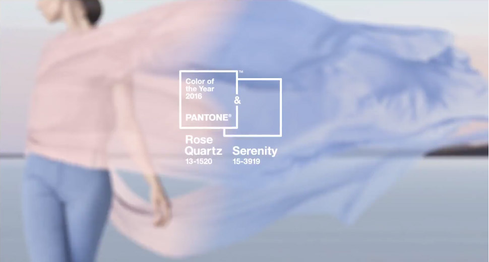
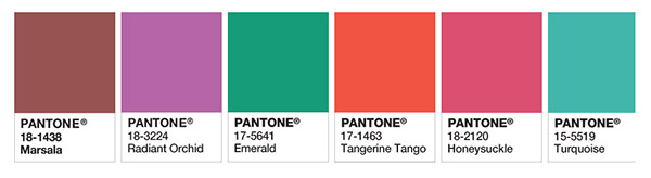
So it seems that for the first time ever, Pantone has announced a duo as its colour(s) of the year for 2016; Rose Quartz and Serenity. And whilst that’s not all that newsworthy, the choice of colours is a massive departure from the bold, bright, clear and strong colours from the last six years; Marsala, Radiant Orchid, Emerald, Tangerine Tango, Honeysuckle and Turquoise to name a few.
2016 is apparently going to be a combination of Rose Quartz and Serenity – a somewhat wishy-washy, airy-fairy couple at first glance… And what on earth do those two colours even go with I’m thinking. Admittedly I’m firmly a fan of a monochromatic colour pallet so writing up my encounters with pastel pink and blue would likely fit on the back of a postage stamp. However, luckily Pantone has an explanation of why these two particular colours…
As consumers seek mindfulness and well-being as an antidote to modern day stresses, welcoming colors that psychologically fulfill our yearning for reassurance and security are becoming more prominent. Joined together, Rose Quartz and Serenity demonstrate an inherent balance between a warmer embracing rose tone and the cooler tranquil blue, reflecting connection and wellness as well as a soothing sense of order and peace.
So now you know. And I have to admit they are very relaxing and tranquil to look at, just need to be careful not to end up with a room decorated in a style more suited to a small child than the tranquil retreat of a stressed-out grown up. So how are we to incorporate Rose Quartz and Serenity Blue into our lives as serious adults? If you’re a lover of pastel colours then this is probably the best news your interiors have heard in a long time – we’ve had a good run of bold, opulent and renaissance type colours and prints so rose quartz and serenity must be like a breath of fresh air for you. This is going to be easy.
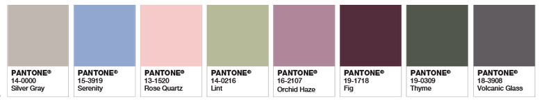
For those of us who like the look of pastels but can never quite get to grips with them (I wholeheartedly include myself in that statement) this is going to be a little trickier. Luckily Pantone have come to the rescue again, and put together some handy colour charts showing exactly how you can integrate rose quartz and serenity blue into your existing interior theme. And I have to say, some of those combos are really nice – I’d never have dreamed up a couple of them but the two 2016 pantone colours do breathe new life into traditional colour schemes.
I particularly like rose quartz and serenity introduced to light khaki, heather, burgundy, moss green and dark grey… Pantone obviously has much fancier names than my descriptions but I’m trying to paint a picture, and I’m not sure what colour ‘orchid haze’ or ‘lint’ would conjure up in your head whereas ‘heather’ and ‘light khaki’ is probably nearer to what I have in mind. This pallet still has some quite deep, rich colours but if you like your theme to have a bit more pzazz (my word not theirs) then Pantone recommends adding in highlights of silver or ‘hot brights’.
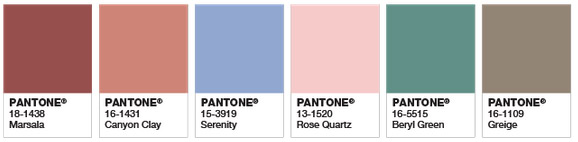
If you prefer something altogether more wholesome and earthy then consider mixing rose quartz and serenity with this year’s colour of the year, Marsala. Add in a liberal dash of canyon clay, stone and soft jade and you have yourself an updated and thoroughly modern take on a natural theme.
Rose Quartz and Serenity for your interior
If you fancy having a dabble at introducing rose quartz and serenity into your interior check out these lighting goodies we’ve curated from our own products. These are a really quick and easy way to test out how much you like this most recent of Pantone’s pairings and indeed how far you want to go with it…
Serenity blue home interior accents
Here’s how to do Serenity in a Danish, minimalist style – who’d have even thought that was possible. But this lovely baby blue Plumen pendant light is just the ticket for a nod to the trend without going OTT… or anywhere near.
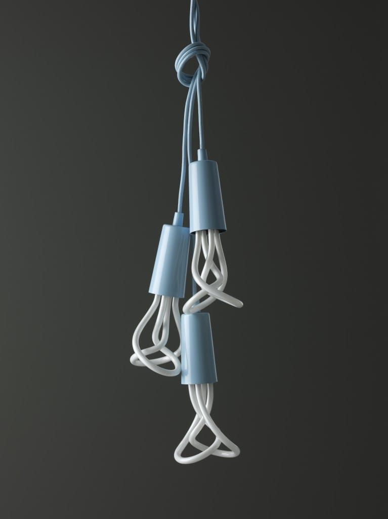
If you’re just not feeling the pale and pastel vibe – how about just updating your existing industrial style light with some pale blue fabric cable. Start small! We’ve even renamed our emulsion blue fabric cable to Serenity for 2016 as our own acknowledgement to the trend.
Silver accessories add highlights to rose quartz and serenity
Check out our amazing silver factory-style pendant light – a great way to keep a grown-up industrial edge to your new rose quartz and serenity theme.

We hope we’ve sparked some ideas of how you could update your interior décor to reflect the relaxing and calming properties of the rose quartz and serenity duo. For more ideas on colour combinations visit the pantone website and if you’ve already got the bug, check out our online store for all the lighting accessories you could possibly need… and a few you probably don’t.